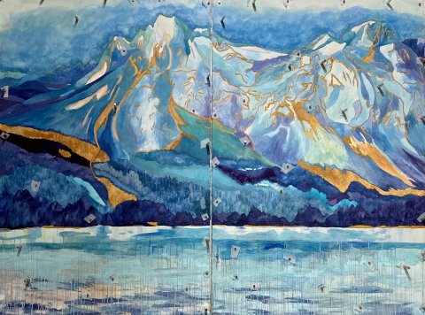
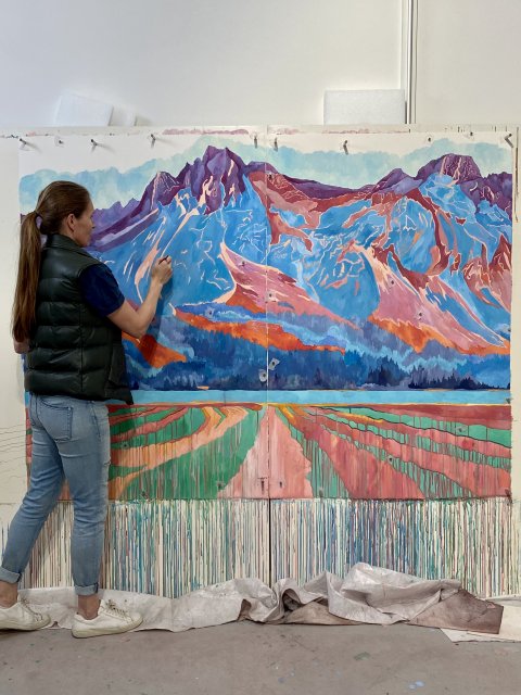
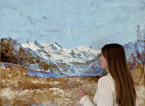
Engadin series
As a Norwegian artist in the Engadin, I follow the footsteps of masters like Segantini and Berry, yet bring a fresh perspective to these majestic Swiss landscapes. Through my open studio, visitors witness how a Nordic sensibility interprets the region's crystalline light and dramatic vistas, adding a new voice to this historically male-dominated artistic narrative.
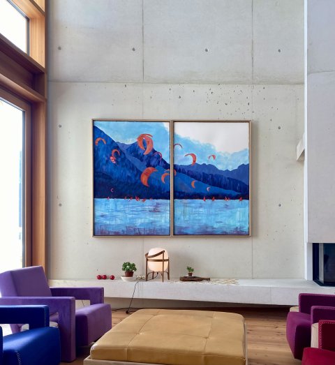


Beyond the Beautiful: The Confrontations Series
My Confrontations series lures viewers in with serene compositions, only to challenge their perceptions with subtle disturbances—an oddly placed object, an unexpected reflection, a discordant color. Each piece invites you to look deeper, where apparent tranquility gives way to complex truths about the human condition.


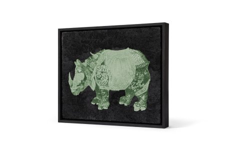
The Masters Series
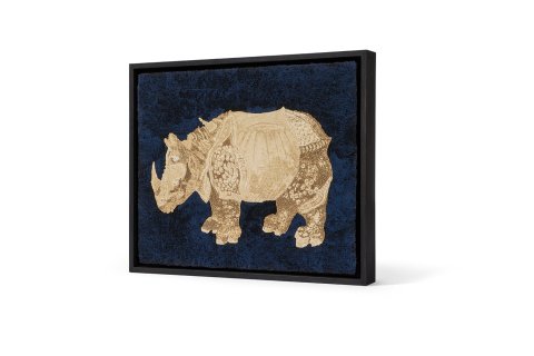
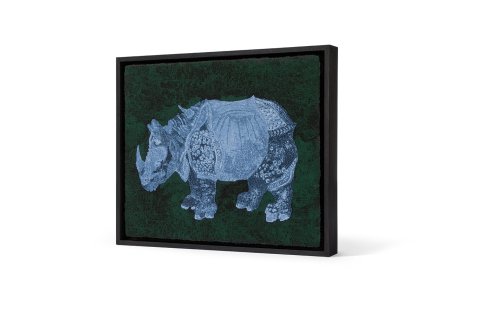
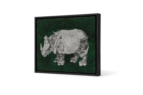
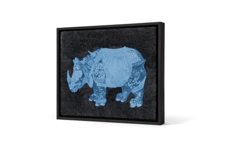
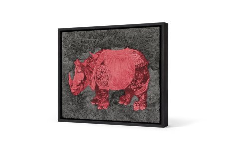
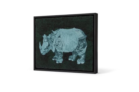
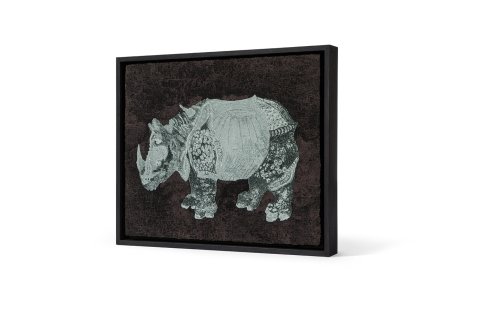
In my Masters Series, I engage in an intimate dialogue with art history's giants. Take Dürer's iconic 1515 Rhinoceros—a revolutionary woodcut that I've reinterpreted through contemporary eyes. While honoring his meticulous detail, I infuse the familiar beast with bold, Warhol-inspired vibrancy. Each piece in this series bridges centuries, proving how masterworks of the past continue to inspire fresh artistic vision.


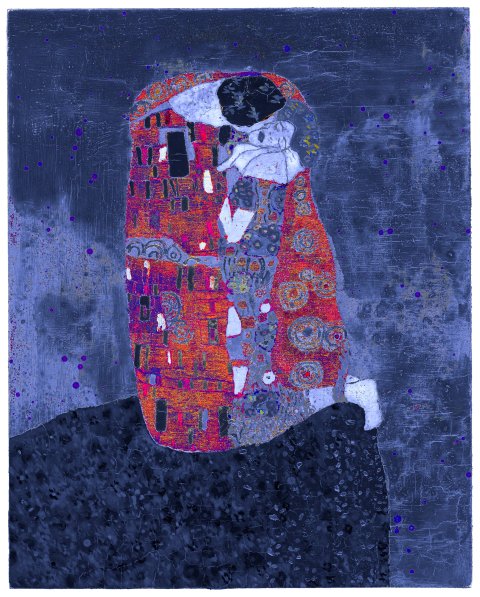
The Masters Series - Gustav Klimt
Klimt's masterpiece "The Kiss" captivated the world with its life-sized lovers wrapped in golden splendor. In my reinterpretation, I weave together diverse influences—from Byzantine mosaics to Japanese woodcuts to Warhol's repetition—creating a fresh dialogue with this iconic image of love. My series proves that even the most familiar masterworks can reveal new facets when viewed through contemporary eyes.